 The Economist drew attention to an article it first published in July 2021.
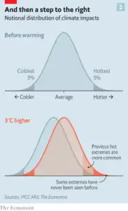
It is a comprehensive, level-headed review of where the world is going. I particularly appreciate these graphs as a way of explaining to lay people the consequences of a shift in average temperatures, with a text that may help readers who cannot understand graphs like these, of whom I know a few.
Those modelling climate impacts have long argued that they do not increase linearly. The further you go from the pre-industrial, the steeper the rate at which damages climb. And as what was rare becomes common the never-before-seen comes knocking (see chart to the right). Judging by the results of specific studies, the differences between 2°C and 3°C are, in most respects, far starker than those between 1.5°C and 2°C.
Leave a Reply