Anticipation of the near future gene census to understand the human gene pool as our common wealth.
What do you do with 770,000 tubes of saliva collected from over 3 million AncestryDNA customers?
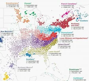
Ancestry scientists have an unusual answer: Create a ground-breaking map of North America’s history-based diversity using the genetic data from the analysis of the samples.
This unique map shows some of our migrations, the echoes of our pioneer ancestors in our genes today.
Each color on the map represents a present-day community of individuals tied together through their genetics. And the location of the dots show where each community’s ancestors lived over generations.
This unique portrait of our country thus reveals that our genes hold the traces of our collective history. But what exactly does the map show?
People moved east to west, less so north to south. See how the differently colored clusters form distinct horizontal bands? The red, blue, purple, and green dots fan out from right to left. This pattern means DNA confirms the descendants of immigrants to the East Coast moved westward.
While people certainly moved back and forth from the north to south as well, if people had moved in the same volume from north to south, you’d see the bands fanning downward and not just from east to west.
And not only can you clearly see the migration patterns westward, you can also see distinct communities of immigrants and their descendants.
Leave a Reply