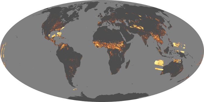
Fire See It Burning Now
The fire maps show the locations of actively burning fires around the world on a monthly basis, based on observations from the Moderate Resolution Imaging Spectroradiometer (MODIS) on NASA’s Terra satellite. The colors are based on a count of the number (not size) of fires observed within a 1,000-square-kilometer area. White pixels show the high end of the count — as many as 30 fires in a 1,000-square-kilometer area per day. Orange pixels show as many as 10 fires, while red areas show as few as 1 fire per day.
Some of the global patterns that appear in the fire maps over time are the result of natural cycles of rainfall, dryness, and lightning. For example, naturally occurring fires are common in the boreal forests of Canada in the summer. In other parts of the world, the patterns are the result of human activity. For example, the intense burning in the heart of South America from August-October is a result of human-triggered fires, both intentional and accidental, in the Amazon Rainforest and the Cerrado (a grassland/savanna ecosystem) to the south. Across Africa, a band of widespread agricultural burning sweeps north to south over the continent as the dry season progresses each year. Agricultural burning occurs in late winter and early spring each year across Southeast Asia.
View, download, or analyze more of these data from NASA Earth Observations (NEO): Fire


Leave a Reply