
Key indicators of how humans are changing the Earth:
Sea level, species, carbon dioxide, sea ice, population, daily temperature extremes, annual climate change performance by country, air pollution, temperature records, climate change indicators, top ten emitters, historic emissions, electric vehicles.
The most recent addition is at the bottom.
********************
Click on each link to see the latest data.
********************

Sea level
“Sea level rise is caused primarily by two factors related to global warming: the added water from melting ice sheets and glaciers and the expansion of seawater as it warms. The first graph tracks the change in sea level since 1993 as observed by satellites.”
********************

Species at risk of extinction
“By the end of the century, half of all species could be facing extinction. The rate of species extinction is up to 10,000 times higher than the natural, historical rate.”
********************
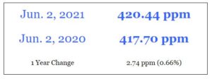
Atmospheric carbon dioxide
“This table presents the most up-to-date, daily average reading for atmospheric CO2 on the planet.”
Values for each year have been increasing at an ever-faster pace since the record was started in 1958.
********************
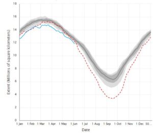
Arctic sea ice
“Scientific analysis on Arctic sea ice conditions. We provide an update during the first week of each month, or more frequently as conditions warrant.”
The summer of 2021 has been well below the long-term average, though not the lowest ice cover on record, which was in 2012.
********************

Human population
“The chart illustrates how the world population has changed throughout history. ”
As of 04-May-2021: 7.9 billion of us.
As of 31-May-2021: 8.2 billion of us.
********************
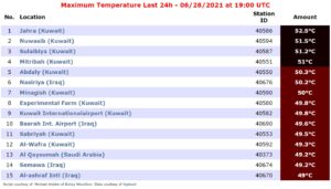
Daily temperature extremes
“Maximum and minimum temperatures, plus maximum precipitation, in the last 24 hours. Data can be sought globally, by region, and by country. The most intense heat waves and storms can be located.”
On 28/29 June 2021, despite heat waves in North America, Siberia, and the Punjab provinces of India and Pakistan, the area around the Gulf of Arabia has the hottest temperatures, well above 50 °C.
********************
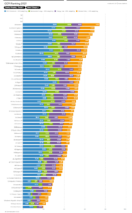
Annual climate change performance
In 2020, 61 countries were scored. None had a high enough score to warrant an award of 1st, 2nd, or 3rd place.
4th Sweden
5th United Kingdom
6th Denmark
7th Morocco
…
58th Canada
59th Iran
60th Saudi Arabia
61st United States of America
********************
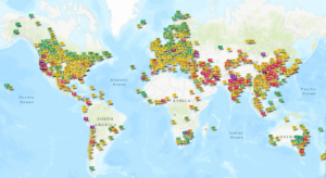
Air pollution indices
The map shows the real-time air quality for more than 10,000 stations around the world based on fine particulate matter (PM10 and PM2.5), nitrous oxide, sulfur dioxide, ozone, and carbon monoxide. The highest local values appear on top of other nearby stations.
28 August 2021 was a particularly bad day for people in Las Balsas-S. Andrés y Sauces, Canarias (Canary Islands), with an AQI of 835, but the pollution (high PM10) appeared to be very localized.
********************
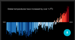
Temperature records
Coloured bars show average temperature by year (blue is cooler and red is hotter than the 1971-2000 average) globally, by region, and by country. The records are also available as stripes for each locale.
We have really been heating up our Earth quickly since the end of WWII.
********************

Climate change indicators
A draft of the IPCC’s AR6 WG1 Summary for Policymakers had a figure “which aimed to put recent changes in carbon dioxide, global temperature, and cherry-blossom-blooming date into a longer context of changes over the past 2000 years, and to show how other climate metrics have changed in recent decades. Many of these time series are shown in disparate places of the report, and brought together in this graphic which also indicates key milestones and discoveries in climate science.”
********************

Top ten emitters
Emissions from Top 10 contribute 68.71% to global emissions!’ [2018 data]
- 26.1% China (12.4 Gt CO2-equivalent)
- 12.7% United States of America (6.0 Gt)
- 7.5% European Union (3.6 Gt)
- 7.1% India (3.4 Gt)
- 5.4% Russia (2.5 Gt)
- 2.5% Japan (1.2 Gt)
- 2.2% Brazil (1.0 Gt)
- 2.0% Indonesia (965 Mt)
- 1.7% Iran (828 Mt)
- 1.5% Canada (723 Mt)
********************
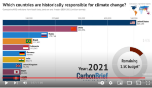
Historic Emissions
Racing bars show how emissions by country changed over the last century and a half. The countries in which the Industrial Revolution began were initially the biggest emitters, and that legacy persisted until recently. Now, with the Second Industrial Revolution (Tech Revolution) and globalized trade, emissions have been shifting to other countries. However, the United Sates of America remains mainly responsible for the carbon dioxide in our atmosphere.
********************
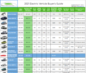
Electric Vehicles in Canada
As of 2021, there are many electric vehicles (EVs) available in Canada. This spreadsheet provides some comparative data for them, including range, price, acceleration, delivery time, and more.
Technology continues to improve and options continue to increase as manufacturers move away from internal combustion engine (ICE) vehicles.
********************

Floods around the World
FloodList shows news and information on the latest flood events from around the world. It receives funding from Copernicus, the EU program for monitoring the Earth’s environment using satellite and in-situ observations.
********************

NASA’s Webb Space Telescope
From arrival at the European Space Agency’s launch Facility in Kourou French Guiana, through launch and deployment, the pages linked here are your starting point for exploring Webb’s launch and commissioning.
********************
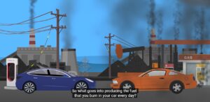
Space EV or Internal-Combustion-Engine (ICE) Vehicle: Which Pollutes More?
One person found a lot of misinformation out there about pollution generated by electric vehicles (EVs), so he spent over a year researching this and was shocked to find out what actually goes into producing the gas we burn in our cars every day.
********************
 What People Pay for Energy around the World
Prices depend on local availability, competition, corporate greed, and government policy. They vary from a few pennies per litre to almost US$3. In most major fossil-fuel-producing countries, prices are low. The link includes prices for gasoline (petrol), diesel fuel, natural gas (methane), liquified petroleum gas (LPG), kerosene, heating oil, ethanol, and even electricity (per kWh).
********************

Indicators of Well-Being in Québec
The premise of the process was to recognize and reinforce the interdependence of the economy, society and the environment. One pillar is not adjacent to the other, they are connected to each other. By developing measurable indicators that take the pulse of each pillar, and thus go beyond a single monetary measure of progress (GDP), we are able to recognize this dynamic in a consistent and systematic way. The indicators therefore allow governments to be more effective in monitoring the various pillars and in taking actions to develop a prosperous, inclusive and green Quebec. The lack of frequent reporting regarding these pillars limits the public’s ability to hold our policymakers and other various actors accountable for the results of their actions on important aspects to the daily lives of Quebecers. By having at our disposal a broad range of indicators that measure society’s progress, we ensure that collective well-being and quality of life increase as inclusive for all of Quebec.
********************

Updates for Greenland Ice Melt
Daily melt extent mapping for Greenland Ice Sheet has resumed (as of April 2022), while mapping for the Antarctic Ice Sheet has suspended for its winter season. Calibration of yearly melt detection requires analysis of the springtime snow conditions by a separate program. See our March 18, 2013 post for more discussion of melt calibration. Full analysis for the 2021-2022 and subsequent melt seasons on the Antarctic Ice Sheet are published periodically.
********************
 The Carbon Cycle
Explore an interactive diagram to learn more about the carbon cycle. After opening the link, click on the different labels to view short video clips or images about different parts of the cycle.

Extreme Weather Events Database
********************

Global Climate Dashboard
The US National Atmospheric and Oceanic Administration (NOAA) has a wealth of climate information at < Climate.gov >. There are nine charts on aspects of climate change such as emissions, temperatures, and ice. There are five charts on natural oceanic circulation patterns, such as the ENSO. Some may be interested in going in through the NOAA climate homepage < Climate.gov Home >. There is a huge amount of information on the site, not just the dashboard.
********************
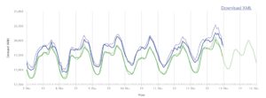
Ontario’s IESO Publishes Details on Provincial Power
The Independent Electricity System Operator for the province of Ontario has interesting data on electricity supply, demand, and prices that are updated very frequently. They have perhaps everything you might want to know about the regional power situation. In other locations, major utilities likely have similar data, though they may not be as easy to reference.
Ancillary information sources on electricity across Canada, most describe how electricity is generated in the jurisdiction and provide advice on power generation and commercial/residential use:
- Link to | BC Hydro overview
[There is no similar website in BC, but this one has lots of interesting information.] - Link to | Alberta electric system overview
[There are several organizations that co-ordinate electricity supply in the province, including the AESO.]
Link to | AESO dashboard
[This is quite similar to the IESO dashboard.] - Link to | SaskPower
[This supplier does not appear to have a similar dashboard.] - Link to | Manitoba Hydro
[This supplier does not appear to have a similar dashboard.] - Link to | Hydro-Québec
[This supplier has a very limited dashboard, but lots of information for electricity users.] - Link to | NBPower
[This supplier does not appear to have a similar dashboard.] - Link to | NSPower
[This supplier does not appear to have a similar dashboard.] - Link to | PEI Energy Corporation
[This supplier does not appear to have a similar dashboard.] - Link to | NLPower
[This supplier does not appear to have a similar dashboard.] - Link to | Canada Energy Regulator
- Link to | Energy rates in Canada
[This link is to a comparison site that provides energy-price-related information for BC, AB, SK, MB, ON, and QC.]
********************

CBC Climate Dashboard (Canada).
[Recent news items, historic weather data and trends, projections. Ed.]
“The data for the Climate Dashboard comes from the Meteorological Service of Canada (MSC). We display weather information for 490 locations in real time.
While the MSC has data available for more than 800 locations, we’ve excluded locations with less than 80% of the data for the 1981-2010 period. This is the timeframe used to compute historical averages. Locations without historical records before 1981 have also been excluded.
For more information on the weather stations and datasets used, click on the [information circle ] throughout the page.
If you notice problems with the data, or want to suggest improvements, write to us at [email protected].
This page and the analysis behind the data and the charts were shared before publication with Environment and Climate Change Canada experts. Their comments and suggestions helped inform the analysis.
The Climate Dashboard was published on May 3, 2023. It continuously updates with real-time data.”
Link to | CBC Climate Dashboard.
 Canadian Interagency Forest Fire Centre
The Canadian Interagency Forest Fire Centre (CIFFC) provides an up-to-date interactive map that shows where there are forest fires in every region of Canada.
CFFIC is a not-for-profit corporation owned and operated by the federal, provincial, and territorial wildland fire management agencies to coordinate resource sharing, mutual aid, and information sharing. In addition, CIFFC also serves as a collective focus and facilitator of wildland fire cooperation and coordination nationally and internationally in long-range fire management planning, program delivery, and human resource strategies.

Wildfire Smoke Fine Particulate Matter PM2.5
(72 h Hourly Maps at Ground Level)
********************